Honest Interview
A web-based Candidate Matching System
HonestInterview provides an online a space for candidates to anonymously ask employees questions during the interviewing process. By providing more transparency into the team, management, and environment new hires will be working with, we can insure a better fit.
Summary | As Lead Designer, I worked with the CEO/founder and Product Manager to pivot BetterCompany from a consumer app to a B2B SaaS product, HonestInterview (now TalentShare). Here, I was able to reflect on our company’s past pitfalls and refine a human-centered product design process.
Role |Lead UX Designer, Lead Marketing Designer
Team | Eric Cleckner (logo & Icon) & Dave Chennel (Illustration)
Scope | Conceptualize, design, and launch MVP
The Story
Pivoting from B2C > B2B
HonestInterview was BetterCo’s answer to a conservative social media investor environment. In need of a revenue-generating product, we revisited an idea from launch: a B2B product that would improve the hiring process for both company and candidate. After successfully testing the idea through out mobile app, we created a 12-week timeline to release a web-based MVP.
Before we pivoted, we tested a dumbed-down version of HonestInterview on our mobile app
The Problem
Interviewing isn’t fun (for anyone)
For companies, interviews are costly (time, money, and energy). For employees, interviews are a disruption to daily duties and deadlines. For candidates, interviews are one-sided and high pressure. And, too often, seemingly thorough interviewing results in hires that don’t stick.
The Challenge
A better interview experience
How might we improve the interviewing process for everyone and insure a better fit?
“HonestInterview is an anonymous Q&A service for candidates and employees to talk candidly about companies.”
Research
Analyzing the competitive field
What patterns exist in the market and how are competitors meeting the users’ needs?
By analyzing similar products, we identified a pain point that wasn’t being addressed: Companies and candidates couldn’t trust public reviews (i.e. Glassdoor). Reviews were biased, outdated, and didn’t portray everyday office life.
Understanding the market was key to defining the “why” of HonestInterview. We were looking for a pain point that wasn’t being addressed and wanted to improve upon what already existed in the market.
Let’s talk about it.
I set up face-to-face interviews with anyone who would talk to me about their interviewing experience. This helped me understand mental models and language associated with the interview experience.
To convert common feedback into actionable features, I created mental maps, like the one shown above.
Painting a picture
We defined 3 user audiences, each with separate motivations and pain points: the candidate, the employee, and the hiring manager. Aligning the needs of each of these audiences was one of our biggest challenges, especially in trying to create a minimal viable product.
MVP
Intentional simplicity
Deciding on which features to add and which to cut is never easy. This MVP needed to be interesting enough to sell, but simple enough to build in our 2 weeks deadline. Iteration would happen later.
To narrow our focus, we asked what would be needed for a candidate to successfully accept or decline a job, based off of their experience with Honest Interview.
Creating a Narrative
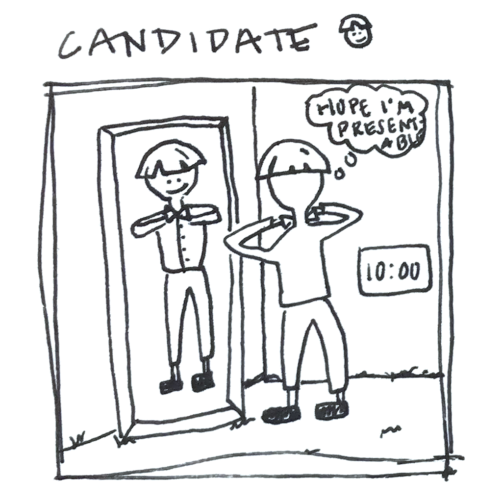
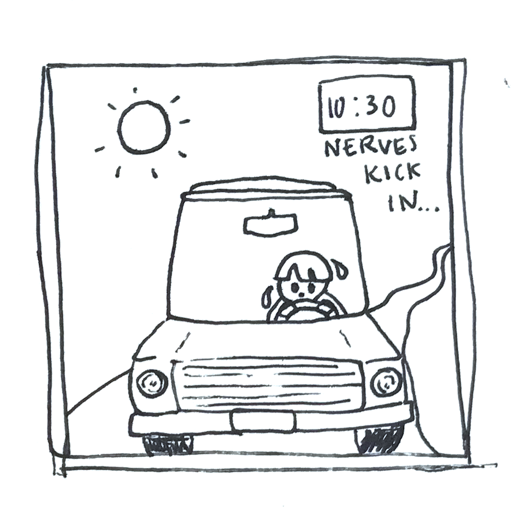
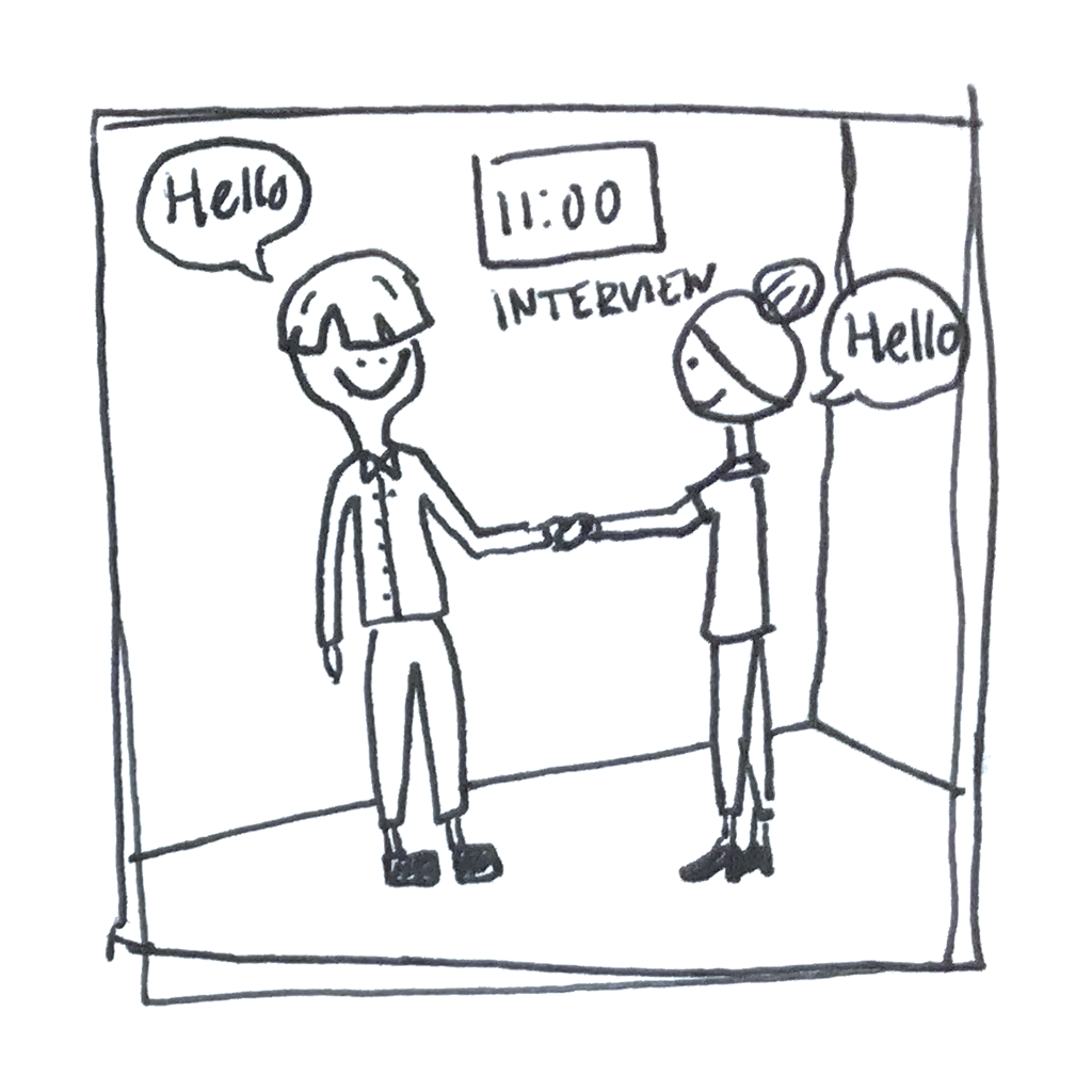
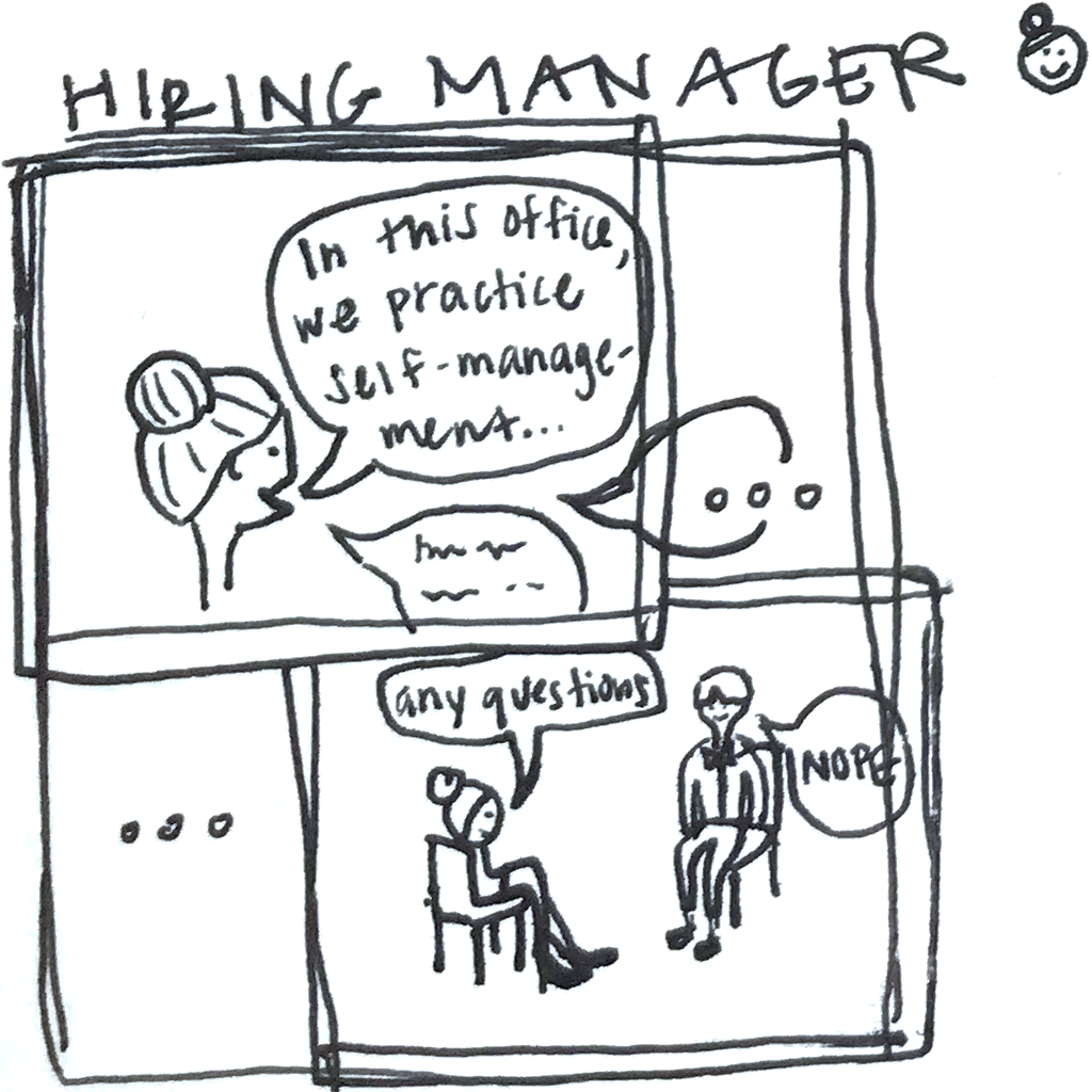
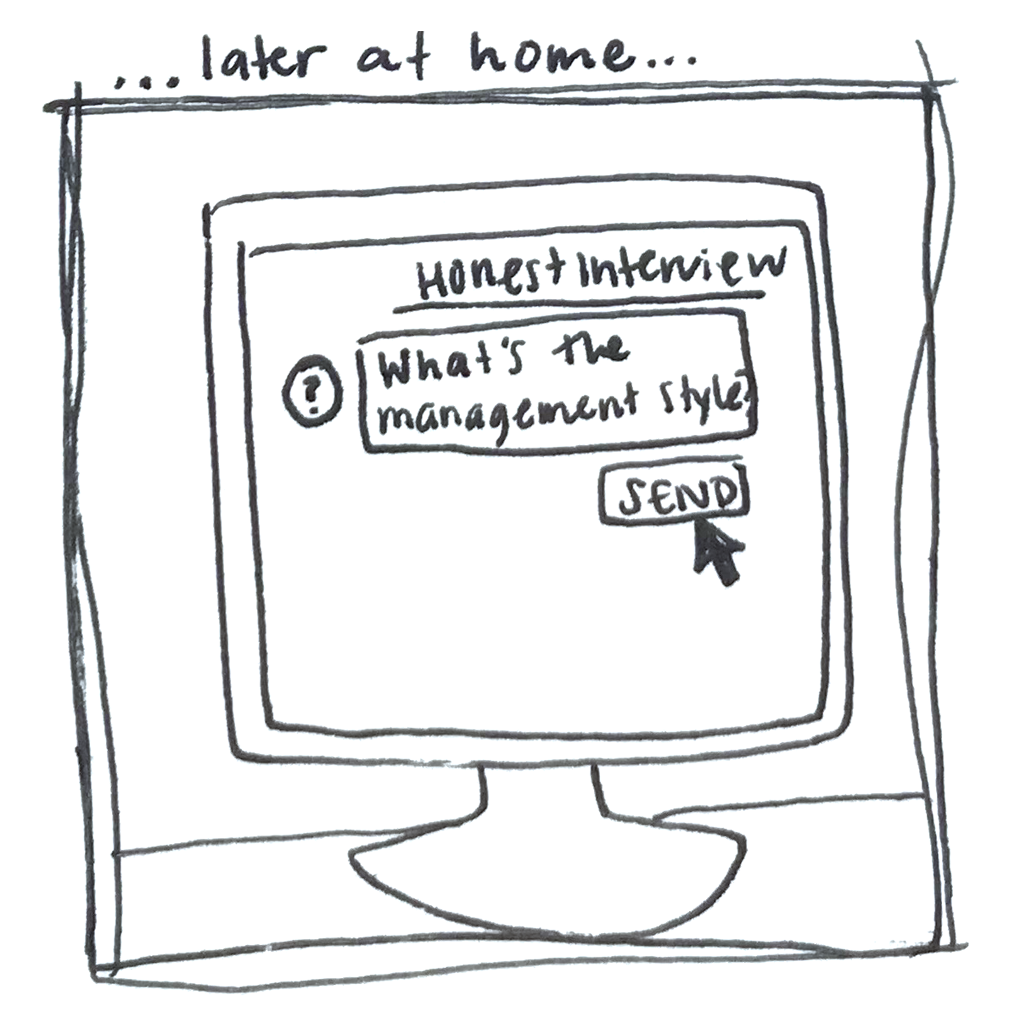
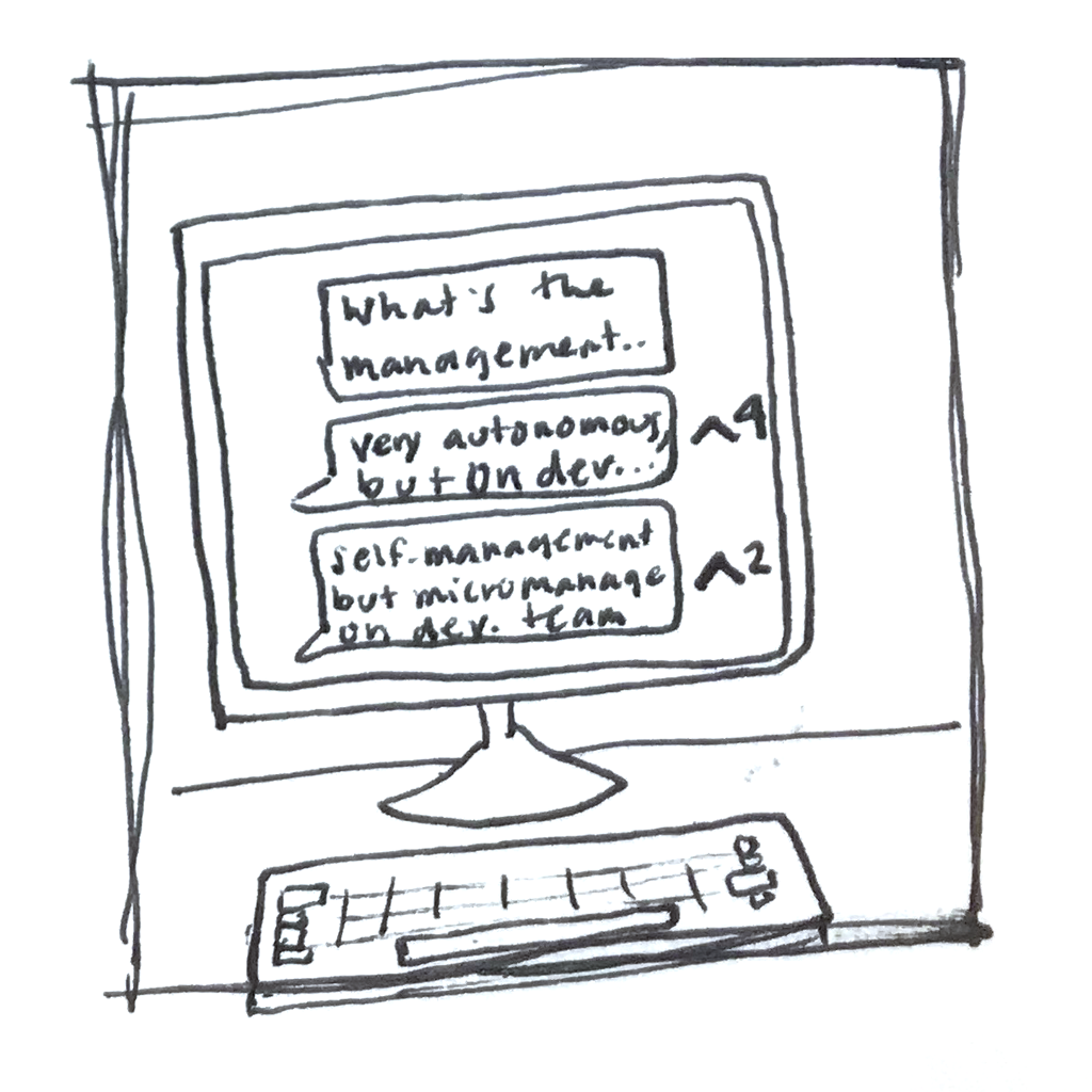
Storyboards help the team visualize and humanize the user. Team members are much more likely to engage with an illustration or cartoon than analysis, diagrams, or notes.
Additionally, storyboards are great to create design that extends beyond the screen and into the “real” world.
V1
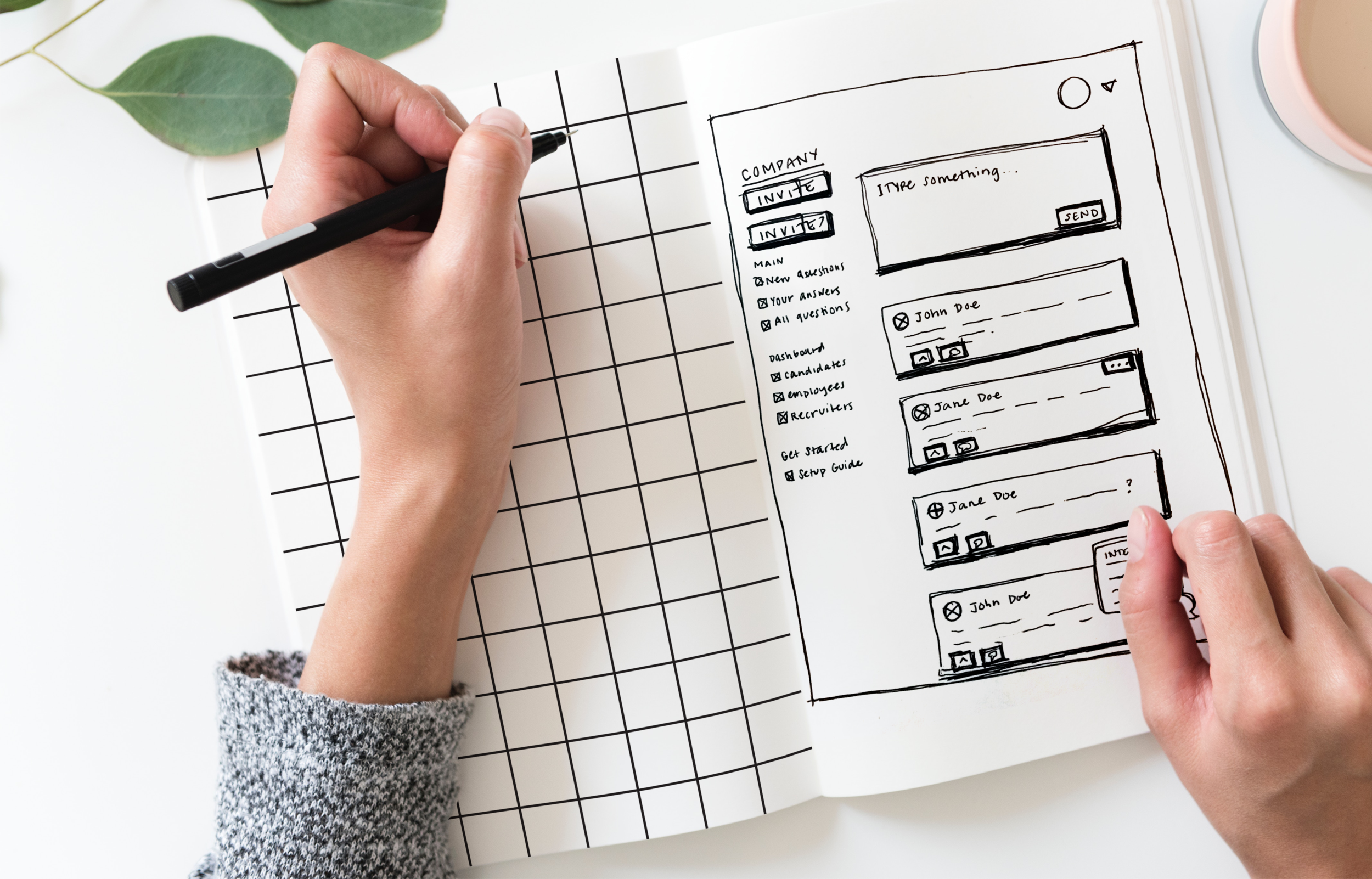
When we had established that the company feed and candidate posting would be core to HonestInterview’s MVP, I started sketching. One of my favorite exercises during this phase is to sketch ‘worst ideas.’ Why would I ever do that? Well, I find that there are bits of contrarian genius in ‘worst ideas’ and I like to understand my mental biases before I dive into a solution.
“Paper wireframes allow me to think outside of the box (screen). I can quickly create something non-precious, scribble it out, tear it up, and start from scratch.”
Visual Design
Not another enterprise company
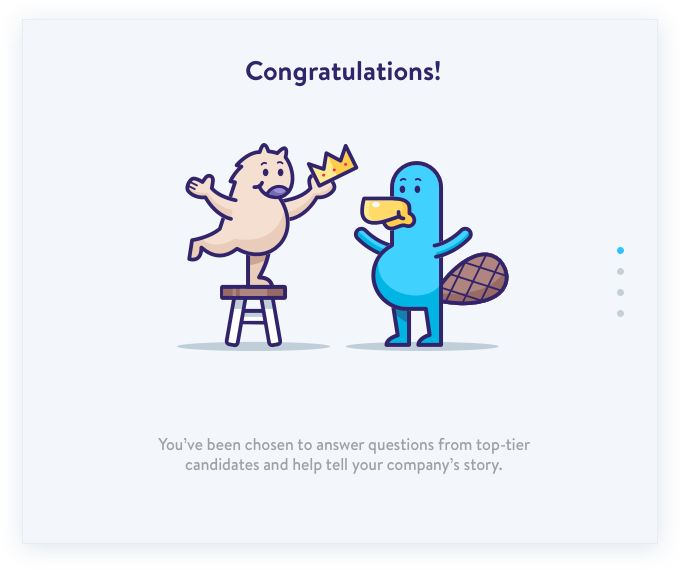
Enterprise sites are usually content heavy and, let’s be honest, boring. For HonestInterview, we updated the playful theme that we developed for BetterCompany to make the website interactive. The joyful colors and animations gave HonestInterview a fresh face for an enterprise product and created an environment where users would feel comfortable talking candidly.
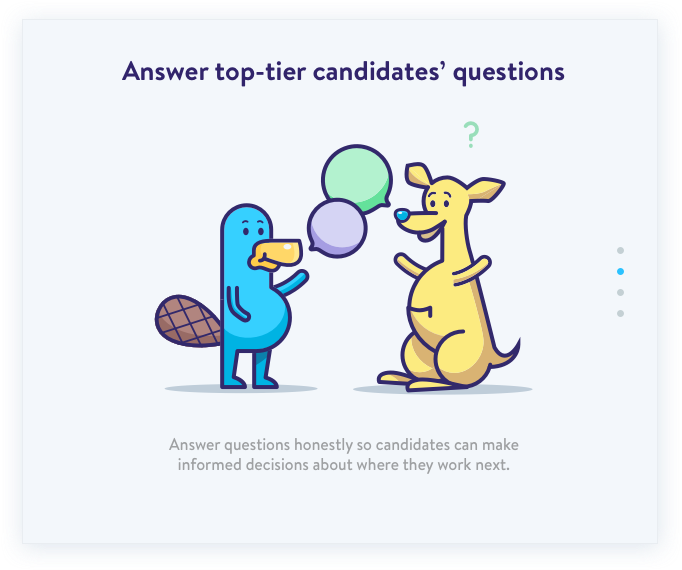
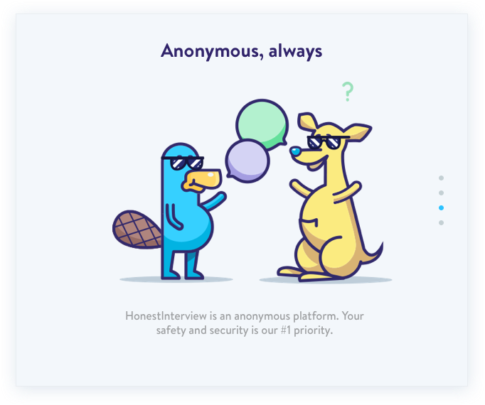
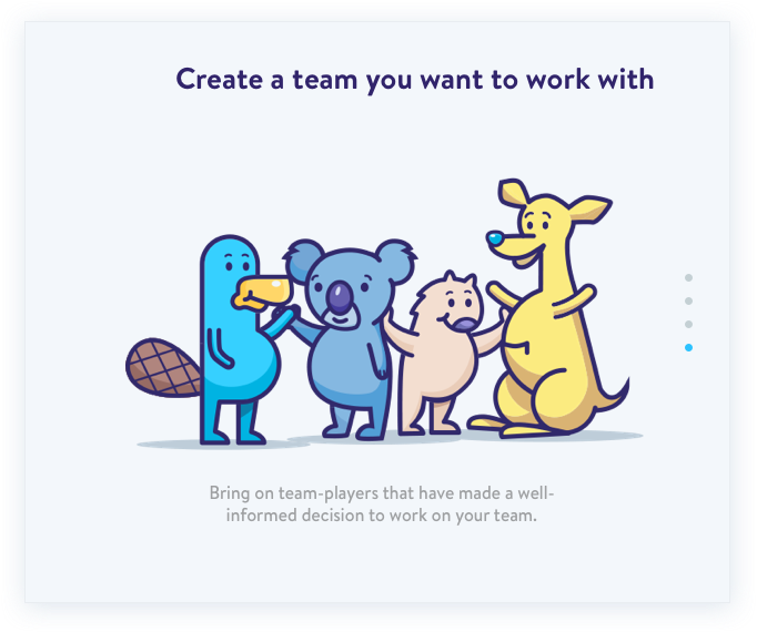
I created these fun illustrations with Eric Cleckner and Dave Chenell to help explain HonestInterview to onboarding employees
Self-Serve
We implemented a free trial to allow companies to test drive the new product. The goal for this flow was both to collect the relevant data from potential clients and to jumpstart the Q&A experience.
Moderation
To ensure a high quality feed and truthful comments, we implemented a moderation function for both our internal team and for an elected moderator at each company
Polished Prototyping
Sell it before you build it
To test product-market fit, I created InVision prototypes to use in the sales cycle. These high fidelity prototypes helped get prospective clients to commit money to our product. Additionally, we were able to use these prototypes to test and iterate features before building everything out.
Quality Assurance
Building fast
One of our biggest challenges was creating a product in such a short timeframe. We couldn’t wait for polished designs to be done before development started.
I created a consistent Style Guide and utilized digital tools like Zeplin to create a faster handoff - developers could start working from wireframes while I iterated on smaller details and illustrations.
“Style guides are a great way to improve team wide communication, unify design, and nail down principles.”
All screenshots are imagined copy and not reflective of any real company or their values.
Reflections
Overall, my experience designing Honest Interview was a great opportunity to learn from mistakes at BetterCompany and implement a more human-centered design process. I’ve spent some time thinking about what I might have tested and iterated on, had I continued working on this product.
Making it more enjoyable
HonestInterview is simple and useful, but we had trouble keeping employees regularly active. To make the product more enjoyable, we could introduce small rewards to employees for answering questions, voting on posts, and engaging with candidates.
Collecting data from clients
Difference in number of successful hires
Track amount of time spent on sourcing and interviewing
Long term: difference in employee “fit” and retention
Lost candidates (to introduce to other potential companies)


